Case Study: A Mobile Health App to Improve Dental Care Engagement
Role: Lead Product Designer (Mobile)
Platforms: iOS, Android
Team: Product Manager, two Developers, collaboration with the Web App team
Tech: Flutter
Link to the webapp version: Health Assistant (HA)
Platforms: iOS, Android
Team: Product Manager, two Developers, collaboration with the Web App team
Tech: Flutter
Link to the webapp version: Health Assistant (HA)
Overview
In 2022 I led the design of a new mobile application intended to become the central point of interaction between patients and dental clinics. The product had a dual purpose. It aimed to increase the value patients receive from the company’s services by giving them ownership over their clinical data. It also aimed to help clinics increase appointment attendance and improve patient retention.
The mobile app was part of a wider ecosystem that included the internal doctor app (My21) and the appointment-management software used by clinics (Availy). My role covered the entire UX design for mobile, plus cross-team alignment on shared components, flows, and data structures.
Context
The company operated mainly in the dental vertical, where recurring visits directly impact the business. However, the existing digital touchpoints for patients were fragmented. Data was stored on web systems that patients rarely visited, appointments were driven by phone calls, and users had no persistent access to their clinical records.
We aimed to build a product that solved all of this, starting with a native mobile experience.
The Problem
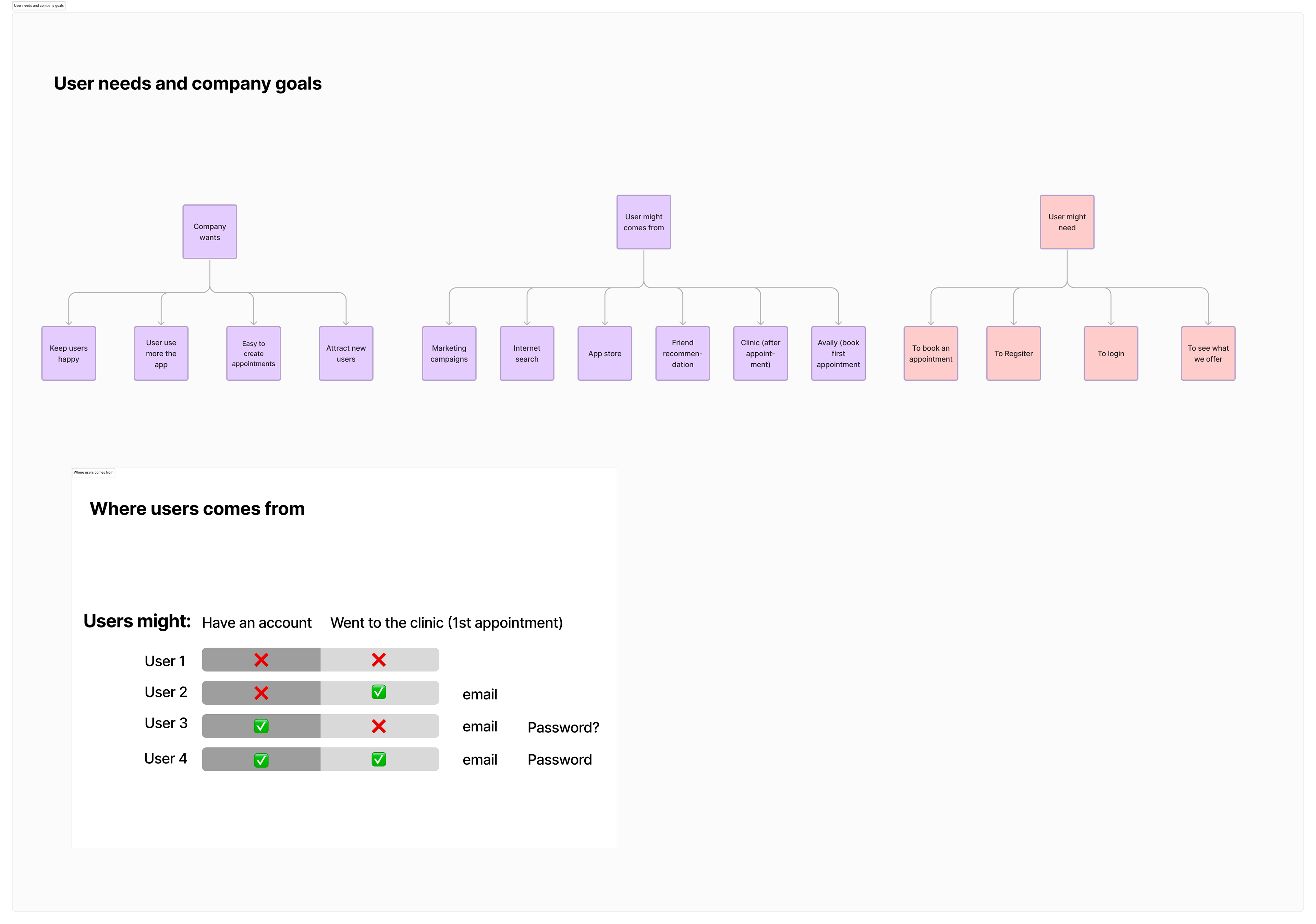
Patients had little reason to download a new app unless it provided clear, ongoing value. Clinics needed a way to increase appointment adherence and improve communication, but without resorting to “engagement hacks”.
The challenge was to design a meaningful, sustainable value loop:
• Give users control of their clinical information
• Provide transparent dental-health insights
• Offer timely, relevant reminders
• Make booking appointments effortless
• Ensure consistency with the broader ecosystem (My21, Availy, clinical APIs)
My Role
I was the sole designer and design lead for the mobile product. My responsibilities included:
• Defining the UX for all major sections of the app
• Running discovery with PM and clinical stakeholders
• Creating end-to-end user flows and high-fidelity screens
• Designing the dental health score model and its visualisation
• Aligning mobile UX with the parallel Web App team
• Ensuring coherence with My21 and Availy workflows
• Contributing to shared components for the design system
• Supporting brand and marketing when needed
What We Built
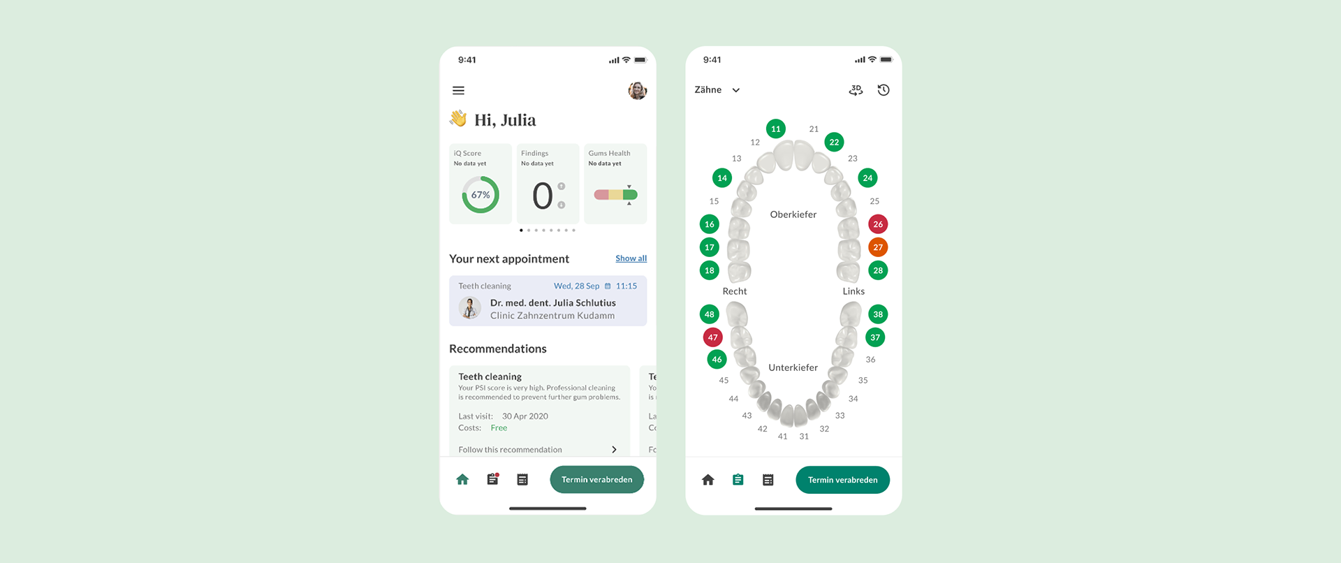
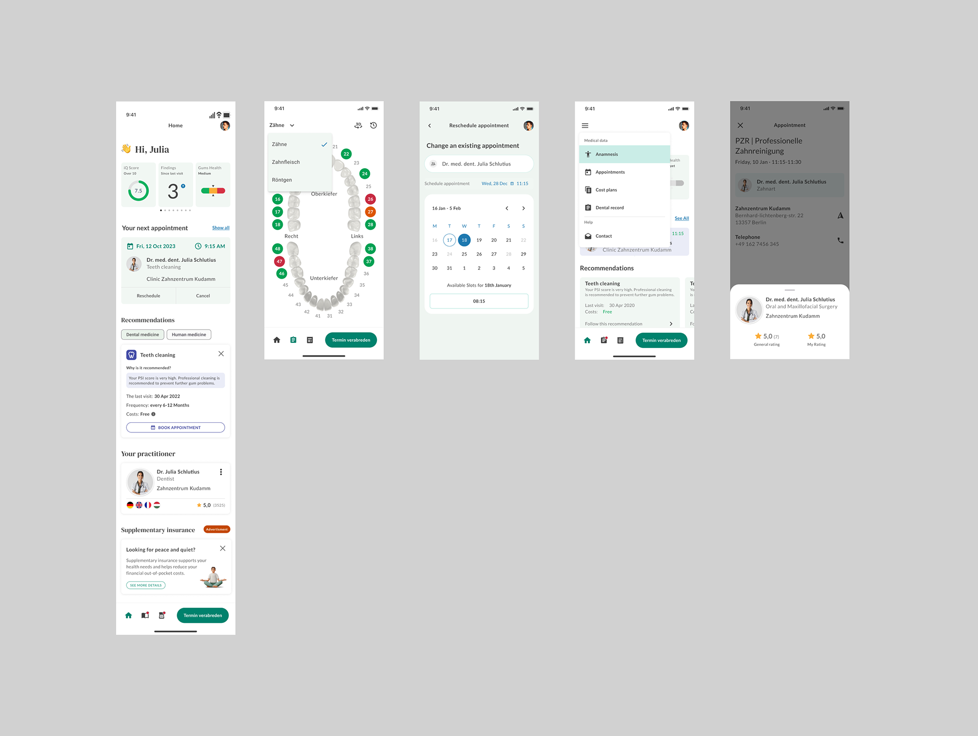
1. Dental Health Overview
A set of clear, accessible health indicators summarising the patient’s oral health status.
Data came from the patient’s previous treatments, cleanings, X-rays, and doctor reports.
I designed the structure and the scoring model together with clinical stakeholders, ensuring:
• transparency (users understand what each score means)
• neutrality (no judgmental tone)
• ctionability (what the user can do next)
2. Clinical Records & Documents
Patients could access their:
• Heil- und Kostenplan (HKP)
• doctor reports
• treatments
• invoices
• X-ray summaries
• visit history
• offers
This feature addressed one of the biggest patient pain points: data scattered across clinics and emails.
3. Smart Recommendations & Reminders
We designed a system of contextual reminders that helped users maintain their dental health without feeling pressured. Examples:
• reminders for cleanings based on last visit
• explanations of why certain time intervals matter
• prevention tips aligned with dental guidelines
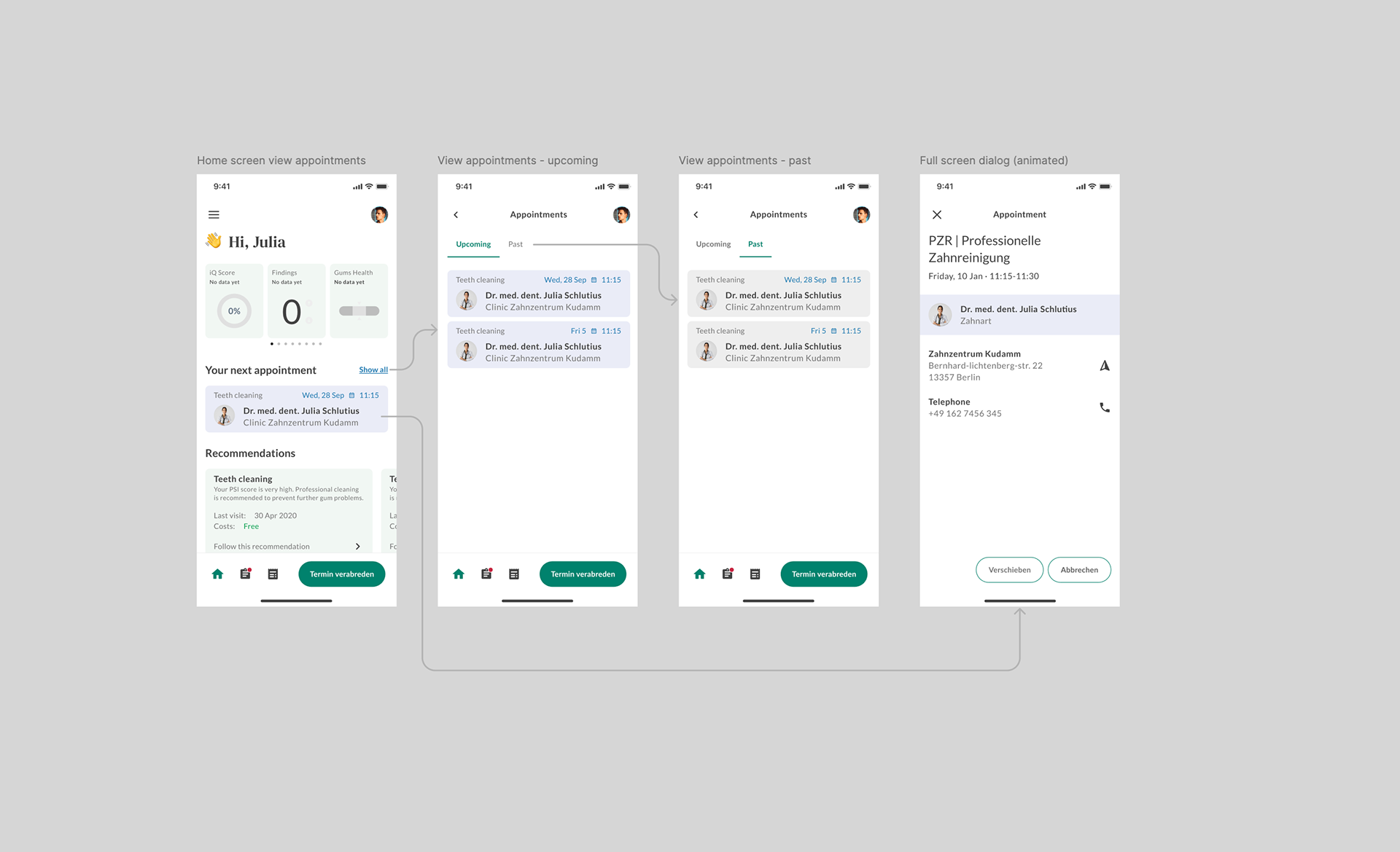
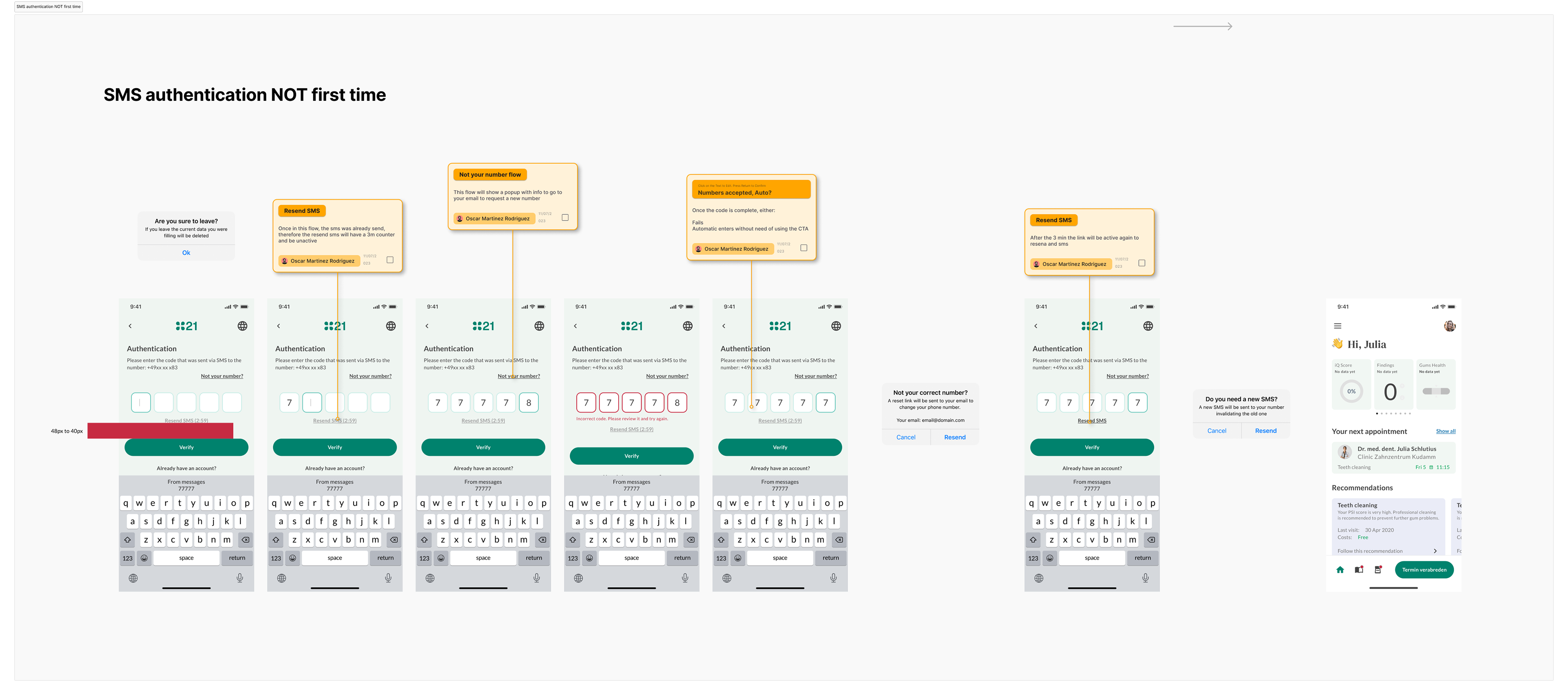
4. Appointment Booking
Directly connected with the clinic’s scheduling system (Availy), allowing:
• real-time slot selection
• syncing with dentist availability
• automatic confirmation flow
• updates reflected in My21 for doctors
This was one of the most technically complex parts due to integration across three products.
Cross-Team Collaboration
While leading mobile design, I also collaborated with the Web team.
Some UX principles developed for mobile were later adapted to the Web App, such as:
• the health score structure
• the recommendations logic
• terminology and naming conventions
• navigation patterns built during My21
This avoided duplicating UX decisions across teams.
Outcome
The mobile version reached a near-final design stage.
Development was paused due to a company-wide budget freeze and a shift of focus toward the Web version.
Even though the mobile app did not launch, the design work had measurable impact:
• it provided the conceptual foundation for the Web App
• it aligned product teams around a shared UX model
• it clarified the long-term product direction (from B2C to B2B/SaaS)
• it consolidated the relationship between My21, Abelli, and patient-facing tools
Here the link to the webapp version: Health Assistant (HA)
Here the link to the webapp version: Health Assistant (HA)