MY21 — Time Tracking Reimagined
Role: Lead Product Designer (Mobile)
Platforms: iOS, Android
Team: Product Manager, two Developers
Tech: Flutter
Link to the Android version: My21
Platforms: iOS, Android
Team: Product Manager, two Developers
Tech: Flutter
Link to the Android version: My21
1. Introduction
My21 is a time-tracking app designed for the doctors of Patient21, a healthtech company in Germany but with the projection of becoming part of their future SAAS ecosystem
What began as a regulatory requirement evolved into a personal productivity tool that helps employees track their hours, understand their balance, and stay connected to the company through small, human touches.
The challenge was to turn time tracking, a legal necessity,
into something people actually wanted to use.
into something people actually wanted to use.
2. Context & Challenge
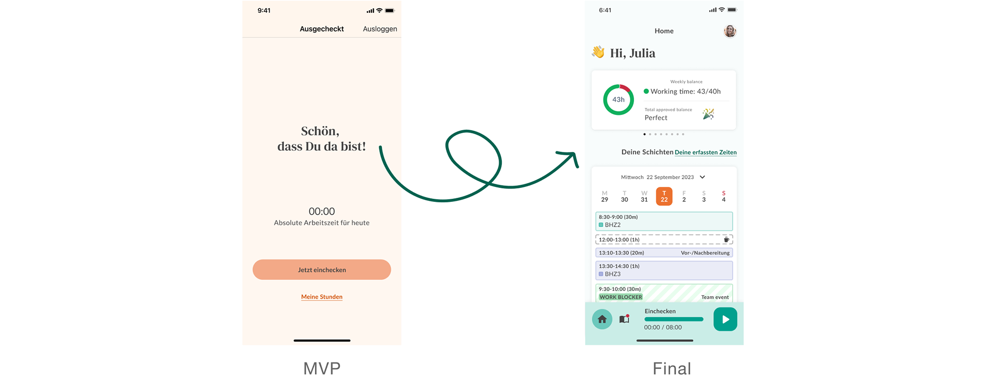
When the project started, a basic MVP already existed. It fulfilled the law but lacked structure, clarity, and any emotional connection.
Doctors saw it as surveillance; management saw it as inefficient.
The goal was to redesign the experience from both sides, giving management transparency while giving employees ownership of their time.
The design challenges were:
1. Rebuild trust between the product and its users (the clinic staff).
2. Create transparency for both sides, management and employees.
3. Turn a compliance tool into a motivating experience.
The design challenges were:
1. Rebuild trust between the product and its users (the clinic staff).
2. Create transparency for both sides, management and employees.
3. Turn a compliance tool into a motivating experience.
3. Team & My Role
I worked on My21 for nearly two years, in parallel with other company projects.
My role: UX & UI design for the mobile app, defining the product vision, user experience, and visual system.
Collaboration: closely with a Product Manager (roadmap, priorities) and two developers (iOS & Android).
Contributions beyond app design: I also supported brand alignment and design system expansion across web and marketing assets.
I started by maintaining and improving the inherited MVP. As trust grew, I gained full design ownership and led the transition toward a scalable, emotionally engaging product.
4. The Approach
The project unfolded in two phases, combining iterative research, prototyping, and user validation.
Phase 1 — Continuity and value driven by research
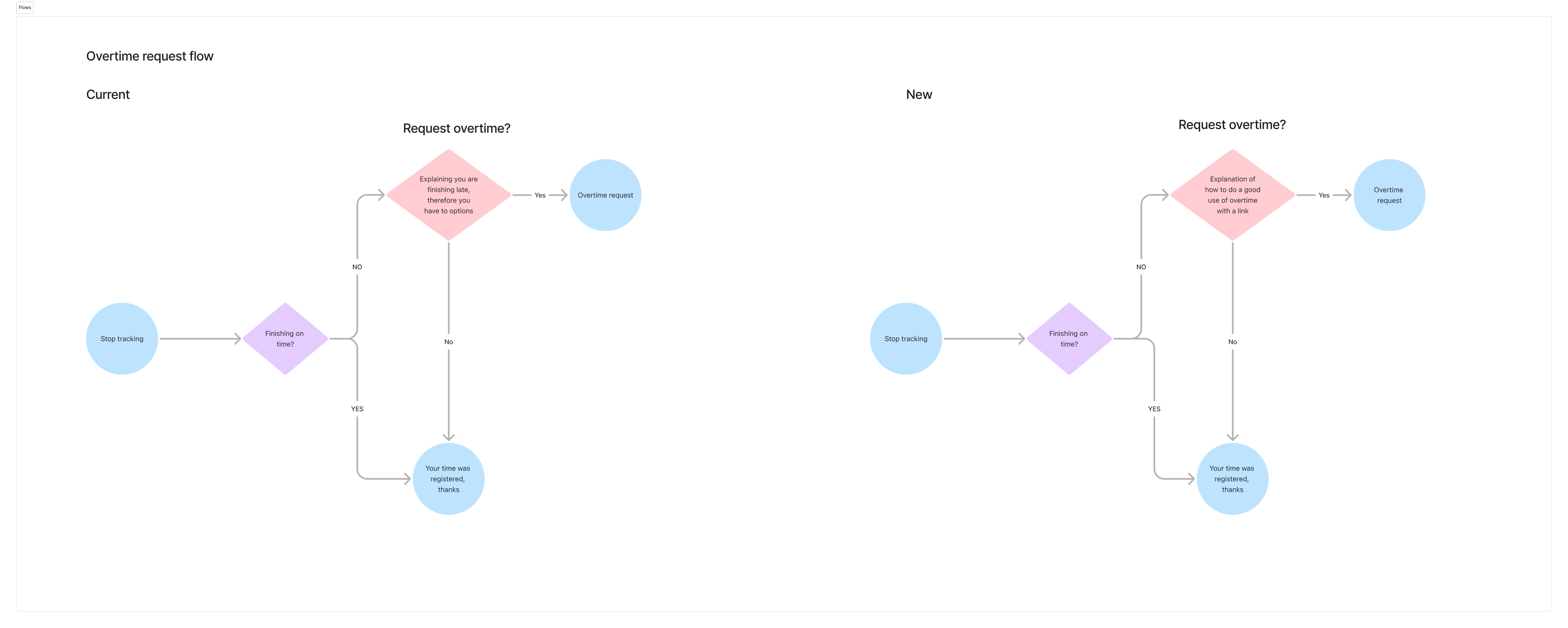
At first, I aligned the interface with the existing design system and workflows. But we didn’t stop there, we introduced new features based on user research and usability testing.
What we did
• Clarified the primary action (start/stop) with clear hierarchy, feedback, and concise copy.
• Improved readability and structure for fast, glanceable use in clinical environments.
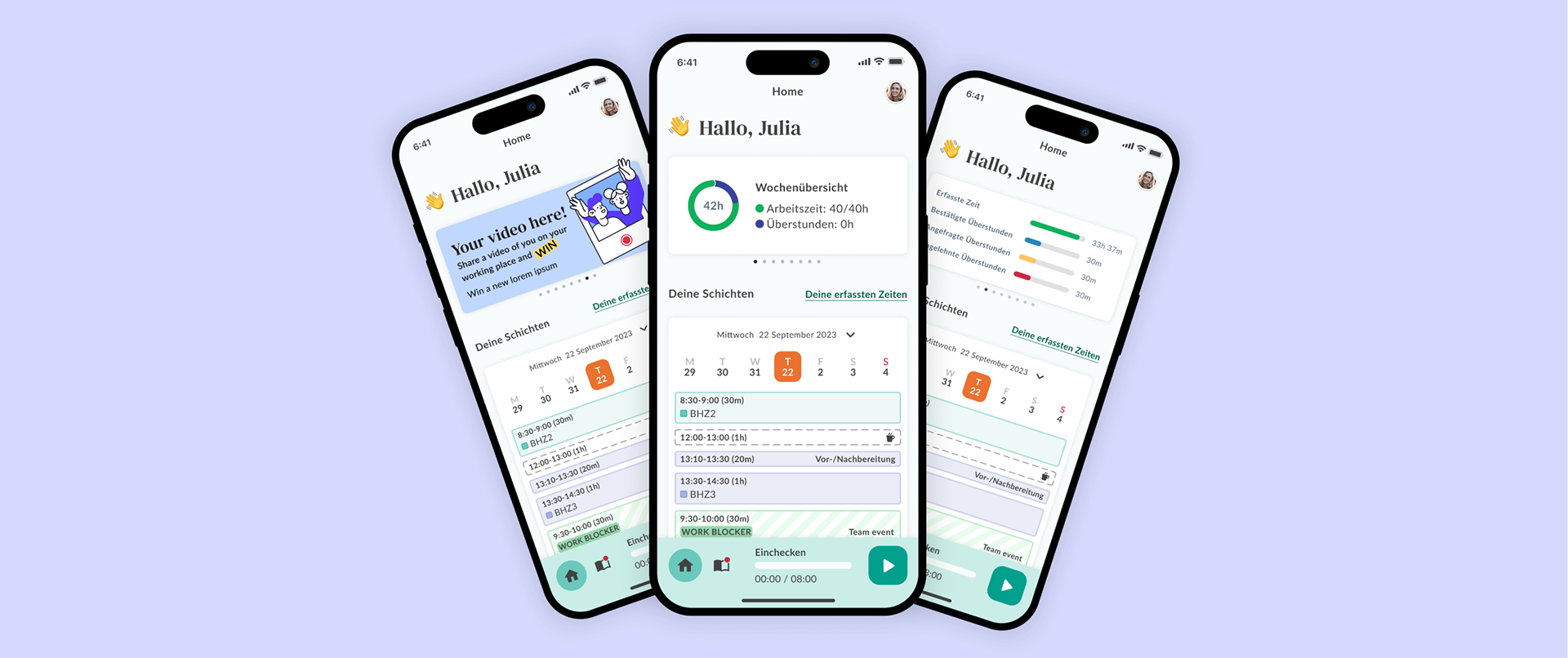
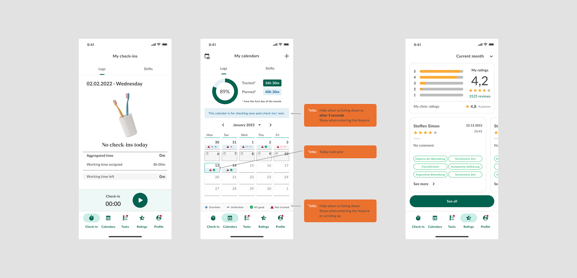
• Added practical features such as upcoming shifts, worked and remaining hours, and weekly balance overviews.
How we validated
• Ran surveys across multiple clinics to map perceptions and friction points.
• Conducted semi-structured interviews to capture real needs and mental models.
• Led prototype-based usability sessions with task scenarios, observing how users interacted, where they hesitated, and what they expected to happen next.
Qualitative outcome
The app started to feel useful. Users could finally see value at a glance, how much they had worked, what remained, and what was next. The perception shifted from control to support.
What we did
• Clarified the primary action (start/stop) with clear hierarchy, feedback, and concise copy.
• Improved readability and structure for fast, glanceable use in clinical environments.
• Added practical features such as upcoming shifts, worked and remaining hours, and weekly balance overviews.
How we validated
• Ran surveys across multiple clinics to map perceptions and friction points.
• Conducted semi-structured interviews to capture real needs and mental models.
• Led prototype-based usability sessions with task scenarios, observing how users interacted, where they hesitated, and what they expected to happen next.
Qualitative outcome
The app started to feel useful. Users could finally see value at a glance, how much they had worked, what remained, and what was next. The perception shifted from control to support.
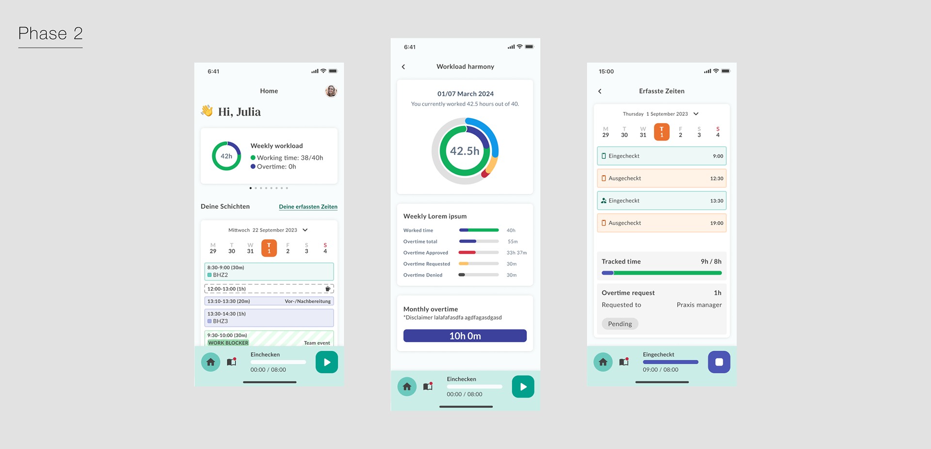
Phase 2 — Redesign for clarity, autonomy, and motivation
After understanding users’ deeper needs, we moved into a full UX redesign to rebuild trust and make the experience engaging.
Core design decisions
• Modular dashboard: displaying worked hours, remaining balance, overtime, and upcoming shifts.
• Dynamic card system: an animated header with rotating cards (auto or swipe) showing real-time insights, internal campaigns, birthdays, or team challenges — blending data with emotion.
• Extended mobile design system: new components, spacing and typography tokens, clear states, and cohesive patterns across platforms.
Research and validation
• Conducted further user testing sessions focused on the dashboard and dynamic cards.
• Observed interactions, comprehension of progress feedback, and reactions to motivational content.
• Iterated on microcopy tone and card frequency to keep motivation authentic, not forced.
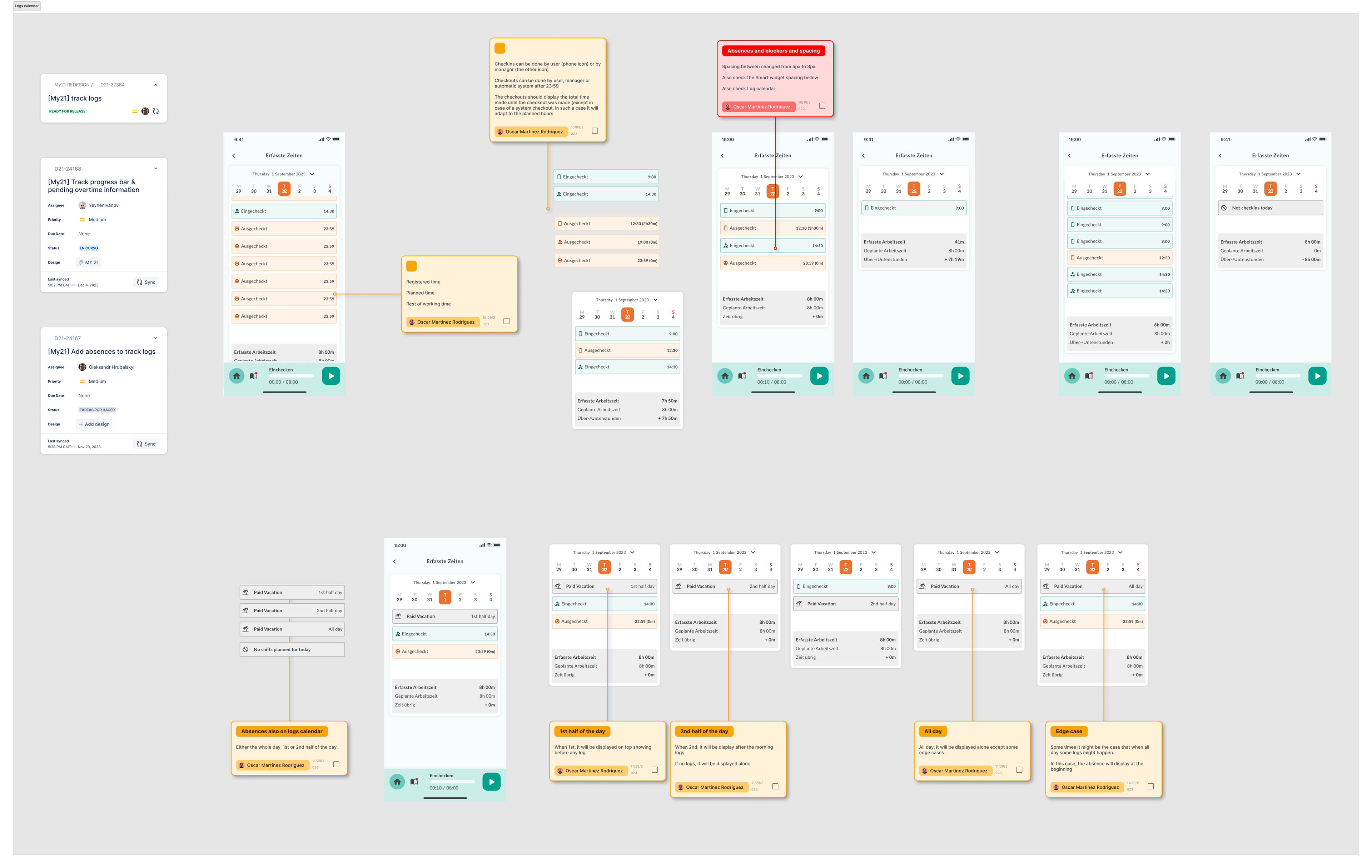
4. Collaboration and delivery
• Co-created the roadmap with the PM, prioritizing high-impact, low-friction features.
• Co-created the roadmap with the PM, prioritizing high-impact, low-friction features.
• Collaborated with developers to ensure consistent states and real-time updates.
• Documented design patterns, component specs, and guidelines to streamline future iterations and SaaS expansion.
5. Learnings
• Adoption begins with perception. If users feel monitored, they disengage — empathy and framing matter as much as features.
• Motivation is designed, not accidental. Contextual, emotional cues drive engagement.
• A design system must live and evolve. Extending it for mobile kept the product coherent without limiting creativity.
If I had more time:
• Introduce SUS-based usability scoring for benchmarked progress.
• Run A/B tests for different dashboard layouts and card behaviors.
• Integrate external calendar sync for proactive planning.
Credits:
• Product Management 1st phase — Alberto Perez
• Product Management 2nd phase — Ewa Picker
• Product Management 2nd phase — Ewa Picker
• Tech Lead — Oleksandr Hrubalskyi
• Software Engineer — Yevhen lvanov
• QA Engineer — Karolina Pekala
• Lead Product Designer — Oscar Martinez